What the first panel got wrong
Nothing was broken. These were hierarchy problems — the panel gave equal weight to things that did not deserve it.
-
01
Three stacked headers before any content.
Title bar, disk card, and a “Can reclaim” chip took the top third of the panel — and the chip repeated a number the disk card already showed.
-
02
The same number printed twice.
“Can free up to 189.2 MB” sat 200px from “189.2 MB reclaimable”. One of them was noise.
-
03
14.2 GB and 189 MB looked identical.
Rows were typographically flat, so a 75× difference in payoff read as no difference. Scanning was done by reading, not by looking.
-
04
A wall of blue buttons.
Every row shouted equally, so nothing was primary — and the buttons out-shouted the sizes, which are the reason anyone opens the panel.
-
05
No way to clean more than one thing.
Reclaiming 21.5 GB meant five separate Clean presses and five confirmations.
-
06
Sections named after the code.
FILES / CLEANUP / TRASH describes how the scanner is built. A person is sorting by “safe to wipe” versus “let me look first”.
The principles that came out of it
Each one is stated generally, then pinned to the thing that actually shipped.
Lead with the number they came for
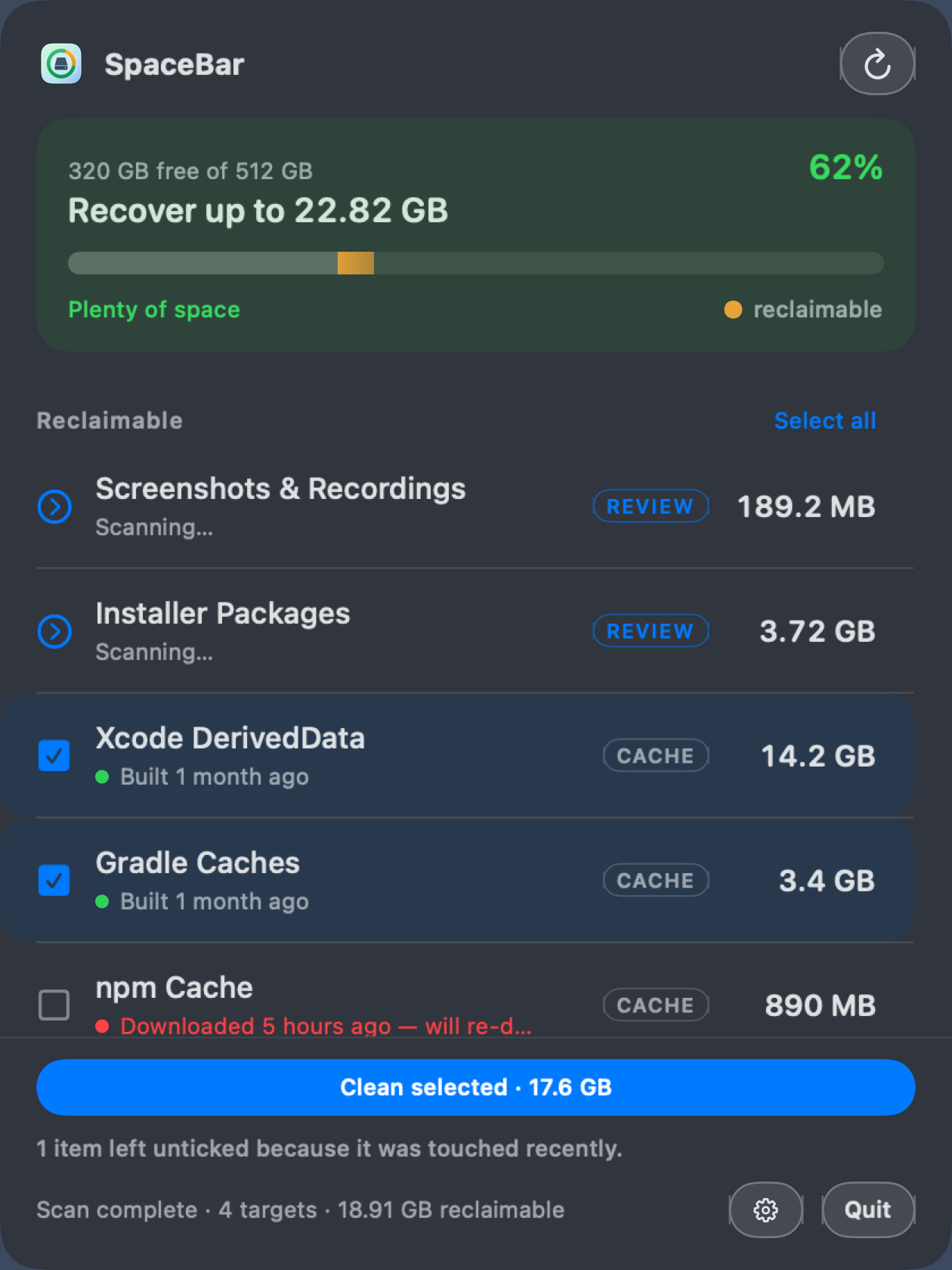
A monitor reports state; a tool reports what you can change. Free space was already in the
menu bar all day, so spending the panel’s biggest type on it repeated a number the user
had just read on the way in.
“320 GB free” is a monitor. “Recover up to 22.82 GB” is a tool. Both can’t be the hero —
pick the one that describes an action.
Shipped
The gauge header keeps free space as a quiet line and gives the headline to recoverable
space.
One loud thing per screen
When every row carries a filled button, nothing is primary and the controls out-shout the
data. Demote row actions to outlined chips, promote one filled button, and let it carry
the number.
Shipped
Row buttons became quiet Review chips; a single footer button reads “Clean selected
· 17.6 GB”.
Encode magnitude visually, not just numerically
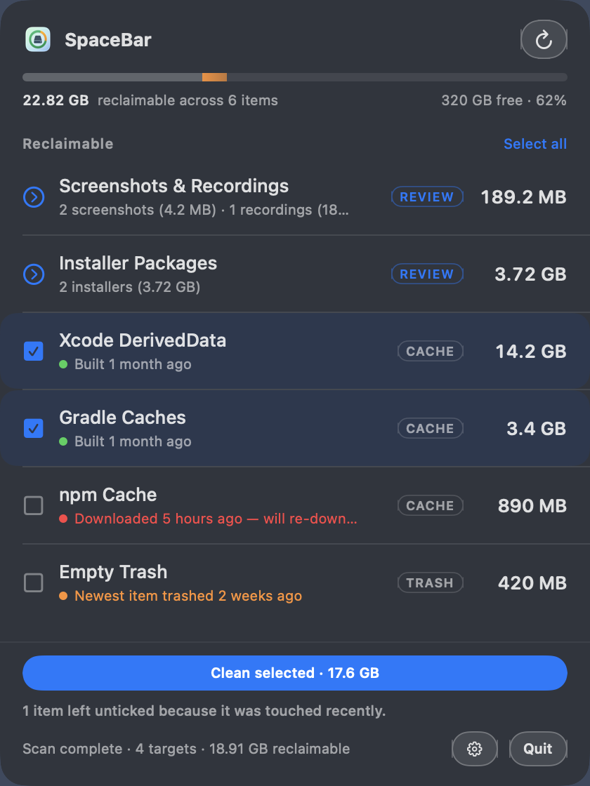
People compare shapes faster than they parse digits. A hairline bar scaled to the largest
item makes 14.2 GB visibly seventy-five times 189 MB, so the big win is found by looking
rather than reading.
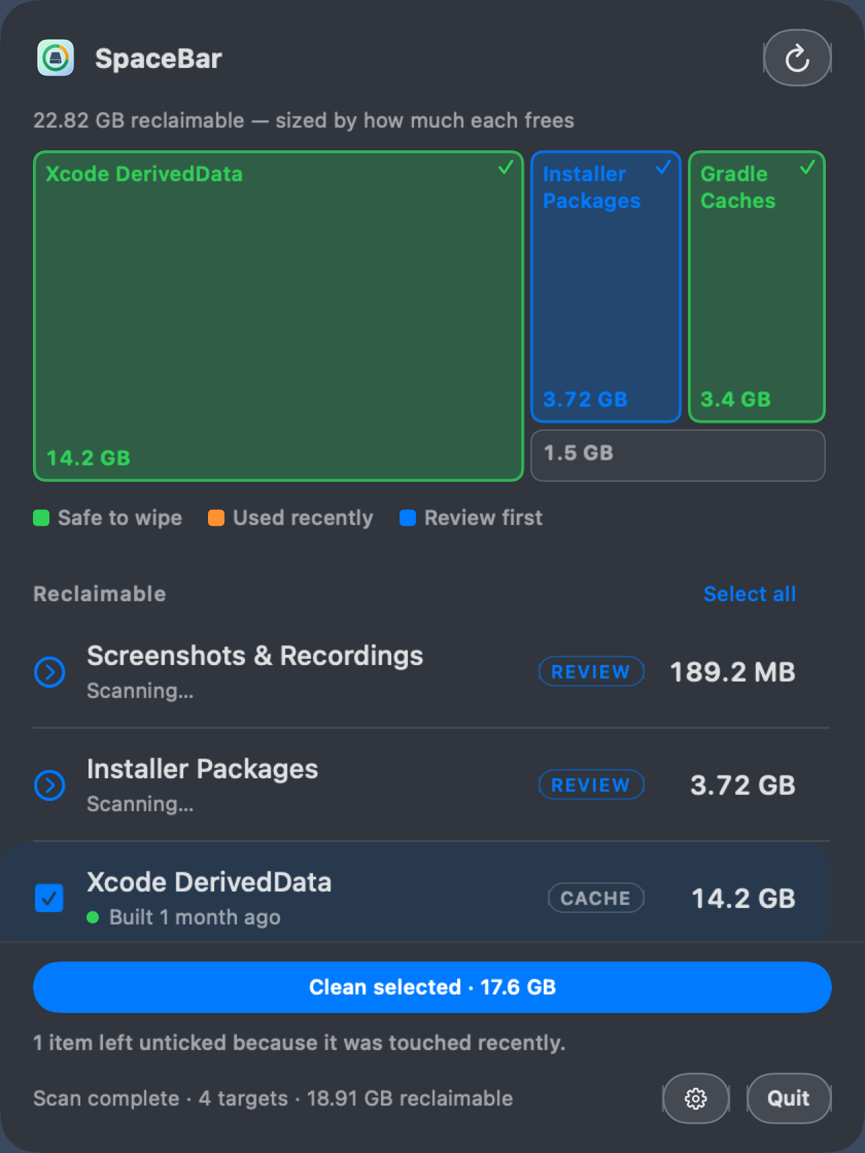
Where proportion is the question, go further: area is the only encoding that makes
“DerivedData is two-thirds of your problem” land without a number at all.
Shipped
Weight bars under every size, plus a Map layout where tile area is bytes.
Find the second number
Size answered “what is worth cleaning” and stopped there. The question underneath — “what
is safe to clean” — was already computed and then thrown away into a grey subtitle.
A 14 GB cache touched an hour ago costs you a rebuild this afternoon; the same cache
untouched since March is free money. Same bytes, opposite decision.
Shipped
Recency became load-bearing: a dot, an age phrase, and the default selection.
Speak the domain’s verbs, not the filesystem’s
“Last modified” is the API’s word. A cache is used, a download is
downloaded, Trash is emptied, a recording is recorded, a
simulator is booted. Same timestamp, but the sentence now says what happened —
and the right verb often changes the decision.
Shipped
Nine per-kind verbs, each with its own caution: “Built 20 minutes ago — forces a full
rebuild.”
Invert the convention when the domain inverts
Most dashboards paint stale things red. In a cleanup tool the mapping flips: cold and
forgotten is the safe green thing to delete, freshly touched is the amber one to leave
alone. Inherit conventions, but check the meaning first.
Shipped
One cold-to-warm scale shared by the age dots and the Map tiles, so list and header tell one
story.
If a fact is on screen, it has to govern the control
An early mock showed “Used 2 days ago” on a row that arrived pre-ticked. Two days is
recent — that was the one row that should have been left alone. Once an age string is
visible, it either drives the checkbox or it reads as a warning the app itself ignores.
Shipped
Anything older than your stale setting arrives ticked; anything newer does not, and the
footer says why.
Make the zero-thought path the safe path
Batch actions are only frightening when the default selection is careless. Let the safety
signal choose the defaults, then state the omission in plain words — the user is told what
was held back without having to audit anything.
Shipped
“1 item left unticked because it was touched recently.” Trash is never pre-selected — it is
the one irreversible target.
Name sections after the decision, not the code
FILES / CLEANUP / TRASH describes the scanner’s architecture. “Safe to wipe” and “Look
before deleting” describe the choice being made — and a section named after a decision
still tells you what is inside when it is collapsed.
Shipped
The scanner split became a small cache / review / trash badge, and
everything sorts by payoff.
Vary the header, share the substrate
Three layouts sound like three apps to maintain. They are not, if the split runs
horizontally: one row component, one selection store, three headers above them. Then the
choice is a single honest question — how much room should the overview get? — and nobody
loses a capability by answering it.
Shipped
Ledger, Gauge and Map. Same list, same ticks, same one-press cleanup underneath.
Settings should restate themselves in real units
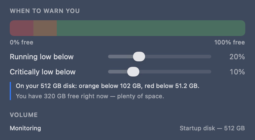
A percentage is meaningless without its denominator — 10% is 51 GB on one disk and 400 GB
on another. Every control should show its effect in the user’s own units, immediately,
against their actual data. A measurement tool’s settings should measure something too.
Shipped
“On your 512 GB disk: orange below 102 GB, red below 51.2 GB. You have 320 GB free right
now.”
Ship the bug fix inside the preference
The warning colour used to fire below 50% free, so a half-empty 512 GB disk with 256 GB to
spare was labelled “Running low”. That trains people to ignore the colour entirely, which
costs you the one moment the app needs to be believed.
A settings pane is where frozen constants go to be corrected — new defaults first, then
the ability to disagree with them.
Shipped
20% orange, 10% red, 30 days stale — all now stored values, all movable.
Degrade honestly
Two tiles look sillier than a bar does, so the treemap needs a floor. The fix is not to
hide the option or silently ignore it: fall back to the simpler header and say why. The
same instinct explains greying out “Docker — not installed” instead of just showing four
rows where twelve were expected.
Shipped
Map falls back to Gauge below three items with a printed reason; tiny targets fold into one
“Everything else” tile.
The three directions side by side, and the point of principle 10: below the header they are the
same screen. Same rows, same ticks, same Clean selected · 17.6 GB. Choosing a layout
answers one question — how much of a 600pt panel the overview deserves — and costs the user no
capability, which is exactly why it was safe to ship all three.
The order mattered as much as the ideas
Building the picker first would have locked in three copies of whatever was still wrong. Substrate first, variants last.
-
Substrate
One row component, sorted by size. Delete the duplicated chip, rename sections to the decision.
-
Recency
Per-kind verbs and the age dot. Small, self-contained, and it makes everything after it safer.
-
Selection
Tick rows, live footer total, one batch confirm — with recency choosing the defaults and saying why.
-
Gauge header
Meter plus totals. A complete, better app on its own — shippable before anything else exists.
-
Settings
Thresholds first, since they carry the bug fix; then stale duration, then per-target toggles.
-
Ledger and Map
The other two headers, then the picker and pill style — cheap, because the substrate was already right.
What each move actually cost
Worth being honest about: options multiply the test matrix faster than they multiply the code.
The mitigation for that last row is worth stealing: pin snapshot fixtures to default settings and
test alternate headers on their own, rather than re-shooting the whole panel for every
combination. Otherwise a padding change means re-recording nine images.
The shortest version
Show the number someone came for, show it once, and make everything else on screen
either explain it or act on it. Most of the work above was subtraction — a repeated
chip deleted, buttons quietened, sections renamed. The only genuine addition was the second
number, and it was already being computed.
Back to SpaceBar